Step positioning
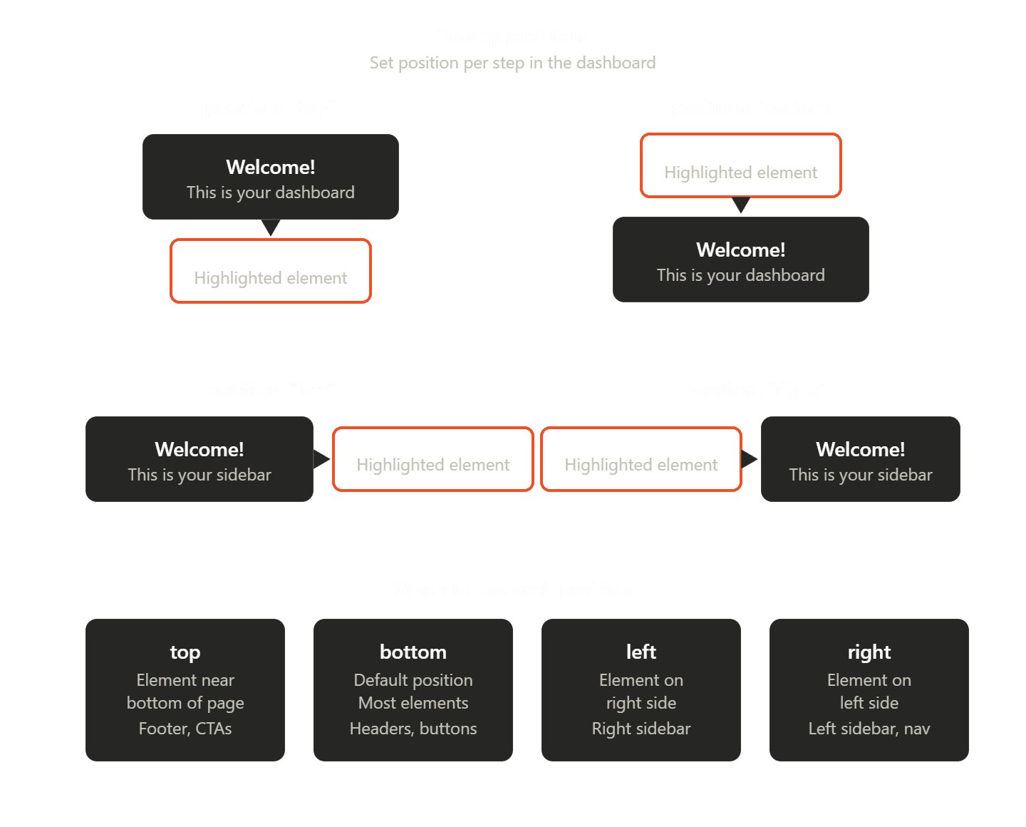
Choose where the tooltip sits relative to the highlighted element.
Options
- Bottom — default for nav and header targets.
- Top — when content sits near the bottom of the viewport.
- Left / Right — sidebars and wide canvases.
Viewport clamping
The SDK keeps the card on-screen when possible; extremely small viewports may compress layout.